Warm Whites Need a Room Comparison
Our guides are independently written. Some shopping links may earn us a commission when identified as affiliate links, at no extra cost to you. Read our disclosure.
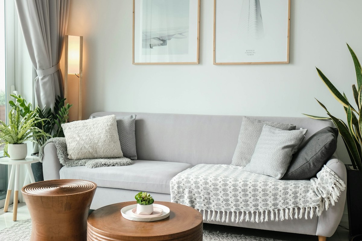
Put the whites beside each other
A pale sofa, wall and throw can each look white on their own and noticeably different together. Begin with the actual retained group instead of trying to settle the colors from separate product photographs. Look at the largest surfaces first; they determine more of the room than a small decorative object.
Describe what you see in ordinary terms. One textile may appear creamier, another cooler or slightly gray. You do not need a technical color label to decide whether the relationship feels comfortable in your room.
Keep the lighting consistent
Compare the surfaces in daylight without moving the whole arrangement between views. Then look again with the lamps you normally use. A combination may feel softer in the evening and more distinct by day. Both are part of the room's ordinary appearance.
Do not treat a phone image as a color certificate. Automatic exposure and white balance can make nearly matching surfaces look identical or much farther apart. Use photographs to remember the arrangement, keeping the physical pieces as the final reference.
Decide what kind of difference you want
A tonal group can contain several related whites without pretending they are exact matches. The variation may give the room depth. The problem is often an expectation of sameness that the actual materials cannot meet.
If the near match bothers you, try a retained piece with a more distinct contrast. A clearly darker neutral or a quiet texture can make the choice feel deliberate. Change one element at a time rather than buying several new cream accessories to force the group together.
Check texture and sheen too
Two pale fabrics may differ mainly because one reflects light and the other stays matte. Look at a broad ordinary area of each, not only a small fold. A heavily textured throw can read as a different shade from the sofa beneath even when their base tones are close.
Keep material care and intended use separate from the visual decision. An attractive textile should still suit its actual role and maintenance routine. Do not apply an improvised treatment to alter a pale surface simply because the undertone differs from a photograph.
Record the relationship you prefer in plain language: warm wall beside cooler upholstery, or a distinct darker textile breaking up the pale group. That note gives future choices a real room reference. If the retained whites feel settled once the expectation of exact matching is removed, keep them. A room can look coherent through deliberate variation, and a small physical comparison is more useful than a long search for an online shade that promises to match everything.
Try a clearly darker retained textile as a comparison before searching for another near-white. If the contrast feels more intentional, the room may need a distinct boundary rather than a closer match. Save the actual piece as the reference.
Related reading
Compare Ready Bedroom Textiles With the Retained Wall, A Calm Sunday Reset for a Busy Week.
More considered choices, fewer impulse buys.
Read our editorial standards →