Two Kitchen Cabinet Finishes, One Quiet Link
Our guides are independently written. Some shopping links may earn us a commission when identified as affiliate links, at no extra cost to you. Read our disclosure.
Read the two large surfaces
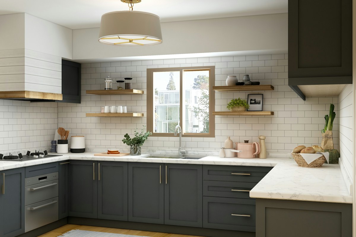
A kitchen with contrasting upper and lower cupboards already has a deliberate division of color. Begin by looking at the actual retained finishes from the ordinary entrance. Notice whether the difference is mainly light and dark, warm and cool or smooth and visibly textured.
Keep the worktop, splashback and floor in the same view. They may already connect the two cupboard groups. A close photograph of a single door cannot show the relationship that the whole kitchen supplies.
Find a connection already present
Look for one existing reference that touches both groups visually. A pale worktop may sit beside darker lower cupboards and relate to light upper ones. A retained timber surface can bring warmth without matching either painted finish exactly.
Name that connection before shopping. If the room already has a clear bridge, another row of matching containers may add clutter rather than coherence. The large surfaces should have room to remain readable through ordinary kitchen use.
Compare one small group
Choose a movable retained object with a genuine kitchen role and compare it in its normal suitable position. Its tone might repeat one cabinet finish or offer a quiet contrast. Keep the rest of the counter unchanged so you can see the contribution clearly.
Avoid moving appliances into unsuitable places or blocking necessary working space for a decorative trial. Use equipment according to its actual requirements. A small physical sample or a photograph of the existing arrangement can clarify the color question without altering the room's operation.
Keep repetition restrained
Repeating the dark finish in every utensil holder, towel and small appliance can make the lower color spread more strongly than intended. Start with one useful echo and look again from the doorway. The second finish can remain represented by the cupboards themselves.
If the room feels busy, check the number of objects and their outlines before blaming the cabinet colors. Several small unrelated groups can compete even when all of them match one finish. Remove an optional decorative item and compare the complete view.
For a simple trial, keep the two cabinet groups unchanged and remove a cluster of optional small containers. If the pale worktop becomes more visible as their connection, the link was already there. The extra objects were concealing it. Record the quiet link you chose, together with the actual retained surfaces. Use that note for a later replacement rather than rebuilding the palette whenever a new accessory appears. Contrasting cabinets do not require two coordinated collections of small objects. Their relationship can be supported by one broad surface or a modest repeated tone, leaving the kitchen's working areas clear and the equipment you actually use in its proper role.
Keep the chosen link visible in the saved room view. If a later cluster of containers conceals it, revisit that cluster before changing cabinet colors. A small accessory edit should be the first comparison, not the last resort.
Related reading
A Weeknight Dinner Table That Takes Five Minutes to Set, Create an Entryway Drop Zone Without Buying a Console.
More considered choices, fewer impulse buys.
Read our editorial standards →