Use the Splashback as a Kitchen Color Reference
Our guides are independently written. Some shopping links may earn us a commission when identified as affiliate links, at no extra cost to you. Read our disclosure.
Include the fixed surface
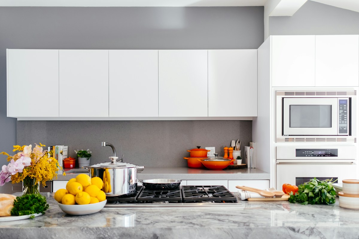
A kitchen splashback occupies a larger area than most small accessories. Before choosing a kettle, container or decorative textile for color, look at that retained surface in the complete room. It may establish a warm, cool, dark or patterned background that affects every object beside it.
Keep the actual material and product requirements separate from appearance. A decorative comparison does not establish suitability for heat, cleaning or food contact. Use the real equipment and surface information for any practical change you are considering.
Compare one movable object
Choose an existing item that already has a genuine kitchen role. Place or view it in its appropriate ordinary position and look at the relationship with the splashback. A neutral object can appear surprisingly warm or cool beside another pale surface.
Keep the comparison bounded. Do not move appliances into unsuitable locations, obscure required clearances or apply unfamiliar materials to the wall just to create a color trial. A photograph of the retained view and a suitable physical sample can be enough to clarify the visual question.
Read pattern from across the room
A small tile repeat may merge into texture from the doorway, while a larger pattern remains distinct. Look at the kitchen from the ordinary approach as well as near the counter. The accessory does not need to match a detail that disappears in most everyday views.
If both the surface and object are strongly patterned, compare a quieter retained item before adding another print. The kitchen may already have enough visual activity through equipment, cupboard lines and the actual food-preparation group.
Check daylight and ordinary lamps
Look at the same relationship under the lighting you usually use. A glossy surface can reflect colors from nearby objects, while a matte one may appear steadier. Use the physical room to settle subtle questions; a phone image can alter pale tones and reflected highlights.
If the combination feels nearly right, name the specific issue before shopping. Is the object too warm, too shiny or too similar in pattern scale? A clear description helps you compare alternatives without restarting the entire kitchen palette.
Keep one useful reference note with the chosen movable group. The splashback can remain the fixed anchor while small suitable objects vary around it. You do not need to repeat its color in every container or replace useful equipment to make the room coherent. A careful comparison with the surface that actually stays can make a modest accessory choice much more deliberate and prevent an attractive isolated item from creating a new decorating problem at home.
A small comparison note can identify the fixed surface and one movable candidate: cool pale tile beside a warm container, for example. Naming the relationship keeps an accessory search focused instead of expanding into a complete kitchen makeover.
Related reading
A Weeknight Dinner Table That Takes Five Minutes to Set, A Calm Sunday Reset for a Busy Week.
More considered choices, fewer impulse buys.
Read our editorial standards →