A Red Chair Does Not Need a Red Cushion
Our guides are independently written. Some shopping links may earn us a commission when identified as affiliate links, at no extra cost to you. Read our disclosure.
Let the chair count as color
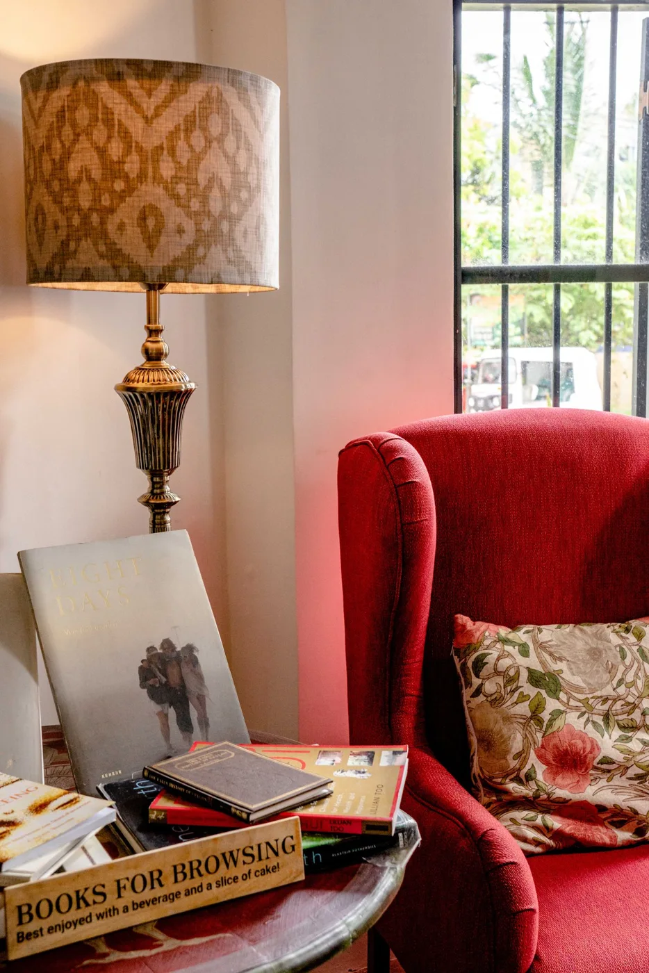
A red chair already provides a substantial accent. Before choosing another red object, look at the complete corner from its ordinary entrance. Include the wall, floor, nearby table and any picture that remains part of the room.
The chair does not need a matching cushion to prove it belongs. Its connection may come through warm timber, a repeated dark frame or a quiet contrast with the wall. Begin by noticing those retained relationships rather than searching immediately for another bright accessory.
Compare the quietest textile
If the chair ordinarily uses a cushion or throw, try the simplest suitable retained option first. A quiet texture can make the upholstery's color easier to see. Keep the piece within its intended use and care needs, and leave enough usable seating for the chair's real role.
Look from a normal distance. A small red detail in another pattern may disappear, while a large bright surface can compete with the chair. The useful question is what the complete room shows, not whether two objects share a color in a close photograph.
Decide which feature should lead
A red chair beside a detailed lamp or strong artwork can create several possible focal points. Choose the relationship you prefer. If the chair leads, simplify an optional nearby detail. If the picture leads, the chair may remain a strong but quieter foreground shape.
Change one object at a time. Removing a patterned cushion while changing the table and artwork together makes it difficult to understand the improvement. A repeated photograph from the same doorway position can preserve the comparison.
Check the room through ordinary light
Red can appear warmer or darker as the room's light changes. Compare daylight and the lamps you actually use before buying a supposedly matching textile. A phone screen may alter the shade, so keep the physical upholstery as the reference.
If one neighboring neutral looks unexpectedly yellow or cold, name that specific relationship. The issue may be the neutral rather than the chair's strength. Try another retained option before assuming the corner needs a different color scheme.
Save the smallest group that makes the chair feel settled and preserves its actual use. You can repeat red once if you genuinely enjoy the result, but the repetition is optional. A clear chair, quiet companion surface and enough visual space can be a complete arrangement. When another accessory appears later, compare what it adds to that saved group. The useful decision is whether the room becomes more coherent, not whether every bright object has acquired a matching partner somewhere nearby.
A useful trial keeps the red chair and nearest table unchanged while substituting one quiet retained textile. If the chair becomes clearer, record that effect. Another red object would have increased repetition without necessarily improving the corner.
Related reading
Choose the Yellow Chair’s Ordinary Evening Role, A Calm Sunday Reset for a Busy Week.
More considered choices, fewer impulse buys.
Read our editorial standards →