Compare a Lightweight Fabric in Different Light
Our guides are independently written. Some shopping links may earn us a commission when identified as affiliate links, at no extra cost to you. Read our disclosure.
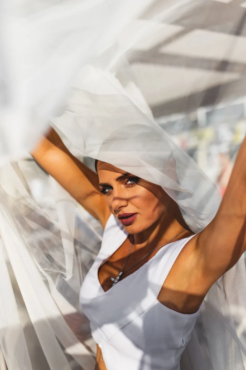
Compare the actual material in context
A lightweight fabric can appear different when viewed against a bright window, a darker background or ordinary room light. Compare the actual garment in the conditions relevant to its intended use before deciding its appearance from one photograph. Keep the question specific: color, visible texture or the relationship with other clothing.
The comparison does not establish the fabric's composition or performance. Read the actual product information for those details. A soft-looking image can suggest an effect without proving how the material feels or behaves on the wearer.
Keep the outfit underneath consistent
Use the suitable underlayer or other clothing actually intended with the garment. Changing that layer between views can obscure which difference comes from light and which comes from the outfit. Respect your own preferences about coverage and appearance.
Avoid treating the comparison as a universal rule about pale clothing. Garments differ in construction, lining and fabric. What works for one piece may not describe another item with a similar color name or an almost identical product photograph.
Look from an ordinary distance
Check the complete outfit as well as a close view of the material. A texture enlarged on a screen may be much less visible in ordinary wear, while a broader contrast may become clearer from farther away. Choose the view relevant to the actual occasion.
If a private photo helps, use consistent ordinary settings without filters intended to alter the fabric. A camera can still interpret light differently from your own view. Keep the image as one reference rather than the final authority on the garment.
Include the familiar outer layer
Compare the lightweight piece beside the jacket or knitwear it will accompany. The retained material can change the visible contrast even when the light stays similar. Try the complete combination before buying another accessory solely to coordinate with a screen image.
Our layer guide supports that practical pairing. The palette guide helps keep the combination repeatable. Exact color matching is optional when a deliberate difference is preferred.
Separate an appearance issue from a care issue
If the fabric seems unsuitable for the intended role, identify why. The issue might be your preferred appearance, an unresolved construction question or care requirements the household cannot follow. Those call for different decisions rather than a single label of too delicate.
Check current product details and return terms when shopping. Do not modify or wash an uncertain purchase to make its appearance match expectations before understanding the relevant requirements. Another existing garment may already serve the occasion more clearly.
Lightweight-fabric questions
Does one bright photograph show every wearing condition? Compare the actual garment in relevant ordinary light.
Can appearance identify fiber content? Read the specific product information.
Must all pale garments use the same layer? Choose from the actual construction and your own appropriate preferences.
More considered choices, fewer impulse buys.
Read our editorial standards →