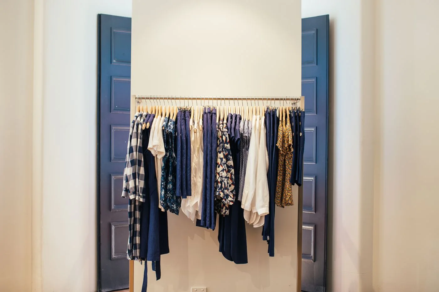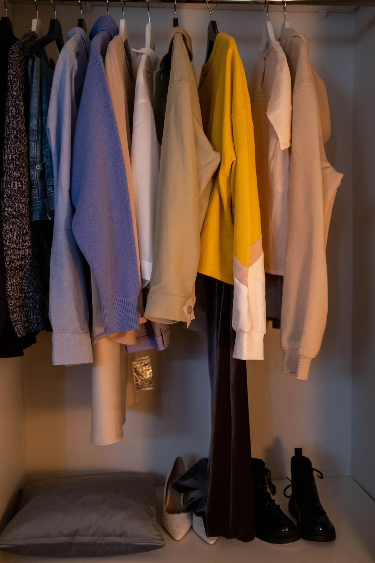
Compare Cream and White Accessories With Your Real Outfit
Our guides are independently written. Some shopping links may earn us a commission when identified as affiliate links, at no extra cost to you. Read our disclosure.
Bring the real outfit into the comparison
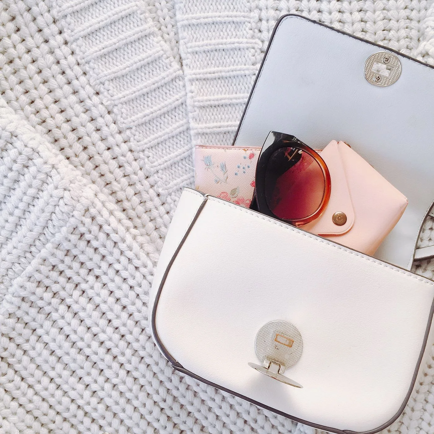
A white bag and a cream bag can look almost interchangeable in separate product photographs while creating different relationships with a familiar outfit. Compare the accessory beside the clothes you intend to wear. Include the actual shade of knitwear, shirt or dress rather than a remembered description of it.
Keep the decision personal. There is no requirement for every pale item to match exactly, and a warmer or cooler contrast can be intentional. The useful question is whether the combination looks and functions the way you want.
Use consistent ordinary light
Look at the pieces together in the ordinary conditions relevant to the outfit. Compare them in the same light at the same time, because two separate views can exaggerate or hide a difference. Avoid making a decision solely from heavily edited images.
If shopping online, treat color names as product references rather than universal standards. One retailer's ivory may differ from another's. Check the actual item details and current return terms before relying on a screen comparison.
Include material and finish
Notice whether the contrast comes from color, surface texture or finish. A glossy pale accessory can appear more distinct beside a matte garment even when the shades seem close. Describe the visible relationship without assuming the photograph establishes the material composition.
Read the actual product information for materials and care. A light color does not mean two objects need the same treatment. Keep appearance and suitability as separate checks so a visually preferred accessory still fits ordinary use.
Keep other accessories steady
Use the shoes and small accessories already intended for the outfit. Compare one pale bag at a time rather than changing the whole combination to justify each option. You may prefer a deliberate mixed-pale outfit without adding a matching belt or shoe.
Our wardrobe palette guide supports repeatable combinations. A small palette can include useful differences within a color family; it does not require every product to come from the same matching collection.
Choose the useful accessory first
Check the actual bag's contents, opening and carrying requirements alongside the visual comparison. A shade that is slightly less exact may belong to the bag that better serves the day. Do not reduce personal essentials just to retain a particular color relationship.
Our work-bag guide connects capacity with real contents. If an existing pale accessory already works, use the comparison to confirm its role rather than creating an unnecessary shopping task.
Pale-accessory questions
Must white and cream be kept apart? Choose the relationship you enjoy; exact matching is optional.
Does a color name guarantee a shade? Compare the actual product and relevant conditions.
Should color override capacity? Keep the accessory suitable for your real belongings and activities.
More considered choices, fewer impulse buys.
Read our editorial standards →